



Table of contents
Why Your Health Tech Website Is Not Generating Leads
Laura Hill, Senior Growth Manager
Your health tech website receives traffic. Prospects visit your product pages. People read your blog. Your company may even rank for several important industry terms.
But qualified leads are not arriving.
The immediate assumption is often that the company needs more traffic. Marketing invests in paid search, publishes more content or begins another SEO initiative.
Traffic may not be the real problem.
A health tech website can attract thousands of visitors and still fail to generate meaningful leads if buyers cannot quickly understand:
- What the company does
- Who the product is designed for
- What problem it solves
- Why the problem is urgent
- How the product is different
- Whether its claims are credible
- What the buyer should do next
Health tech websites also face challenges that do not exist in many other industries. The product may be complex. The sales cycle may involve clinicians, executives, IT, security, finance, legal, procurement and operations. Claims may require scientific support. Buyers may need reassurance about privacy, security, implementation and regulatory considerations before they are willing to schedule a conversation.
A successful health tech website must therefore do more than look modern. It must function as a buyer-education system, credibility platform and lead-generation engine.
The Health Tech Website Lead Problem May Not Be Traffic
Before redesigning anything, identify where the lead-generation process is actually failing.
A basic health tech website funnel looks like this:
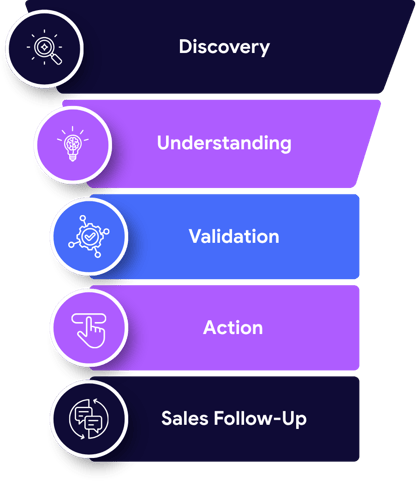
A breakdown at any stage can reduce leads.
|
Website Behavior |
Most Likely Problem |
|
Very little qualified traffic |
Search visibility, media visibility or campaign targeting |
|
Traffic arrives but leaves quickly |
Message, relevance or page experience |
|
Visitors engage but do not click a CTA |
Weak offer or unclear next step |
|
Visitors reach the form but do not start it |
Trust, commitment or form placement |
|
Visitors start the form but do not submit |
Form friction, errors or excessive questions |
|
Forms generate mostly poor-fit inquiries |
Broad targeting or weak qualification |
|
Qualified leads arrive but do not become opportunities |
Lead routing, follow-up or sales alignment |
|
Existing customers visit but new buyers do not |
Weak non-branded visibility or overreliance on brand awareness |
Do not treat all of these as a single “website conversion” problem. Each requires a different intervention.
Unclear Health Tech Positioning Prevents Website Leads
Many health tech websites fail before the visitor reaches the second section of the homepage.
The opening message is often some variation of:
Transforming healthcare through innovative technology.
That statement could describe thousands of companies. It does not tell a hospital, health plan, employer, pharmaceutical company or clinical practice whether the website is relevant to them.
Other common examples include:
- Reimagining the future of healthcare
- Revolutionizing patient engagement
- Connecting the healthcare ecosystem
- Powering better outcomes
- Unlocking healthcare innovation
- Delivering actionable insights
- Transforming care through AI
These phrases sound ambitious, but they do not establish a clear market position.
A strong health tech homepage should answer five questions immediately:
- Who is the product for?
- What costly or important problem does it solve?
- What does the product enable the buyer to do?
- What evidence supports the promise?
- What should the visitor do next?
Compare the difference:
Weak Health Tech Positioning
Transforming the patient experience through innovative digital solutions.
Stronger Health Tech Positioning
Help Medicaid members complete preventive screenings by identifying care gaps, coordinating multilingual outreach and connecting eligible members with nearby providers.
The second version identifies an audience, problem, mechanism and intended result.
It is also more useful for search engines and AI systems because it contains concrete information about the company’s offering.
Before publishing quantified or health-related benefits, verify that the company has evidence supporting the express and implied claims. The Federal Trade Commission states that advertisers must possess a reasonable basis for objective claims and that health-related claims require appropriate substantiation. Review the FTC’s advertising substantiation policy.
Your Health Tech Website Is Trying to Speak to Everyone
Healthcare buying decisions are rarely made by one person.
Depending on the product, the website may need to address:
- Health system executives
- Clinical leaders
- Physicians
- Nurses
- IT leaders
- Security teams
- Finance executives
- Operations leaders
- Payers
- Employers
- Pharmaceutical companies
- Procurement teams
- Patients
- Investors
- Strategic partners
Each audience evaluates the product differently.
A chief medical officer may ask whether the technology improves care. A chief information officer may focus on integration, security and implementation. A finance executive may want to understand cost, utilization and return on investment. A frontline clinician may care about workload and workflow disruption.
If the website attempts to answer every concern in a single generic narrative, it often persuades no one.
Create Health Tech Website Journeys by Audience
A health tech website should provide clear pathways based on buyer type, use case or problem.
For example:
|
Audience |
Website Questions |
|
Clinical leadership |
Does this improve care without increasing clinical burden? |
|
Information technology |
How does it integrate with our systems? |
|
Security |
What data is collected, stored or transmitted? |
|
Finance |
What economic outcome does this support? |
|
Operations |
How difficult is implementation and ongoing management? |
|
Executive leadership |
Why is this strategically important now? |
|
End users |
How will this change the daily experience? |
These pathways can be created through:
- Audience-specific navigation
- Industry pages
- Use-case pages
- Role-based landing pages
- Personalized paid-media destinations
- Relevant case studies
- Role-specific calls to action
Do not force every visitor to begin on the homepage and independently assemble the information they need.
Your Health Tech Website Does Not Establish Urgency
A website may explain the product without making the underlying problem feel important.
This is especially common when a company has developed a genuinely innovative technology. The website becomes a detailed description of features, architecture and functionality.
Buyers do not purchase features because they exist. They purchase because the current situation is expensive, risky, inefficient or unsustainable.
A health tech website should explain:
- What is happening now
- Who is affected
- What the status quo costs
- Why existing approaches are insufficient
- What happens if the buyer does nothing
- Why the problem deserves attention now
For example, a healthcare cybersecurity platform should not begin with a list of monitoring capabilities. It should first explain the operational and clinical consequences of fragmented device visibility.
A clinical workflow platform should not lead with dashboards. It should establish how fragmented processes create delays, administrative burden or missed opportunities.
The product becomes meaningful only after the problem becomes clear.
Your Health Tech Website Does Not Provide Enough Proof
Healthcare buyers are accustomed to ambitious claims.
They have seen countless companies promise to improve outcomes, reduce costs, streamline workflows and transform care.
Without evidence, those statements become interchangeable.
A health tech website should build proof progressively.
Level 1: Corporate Assertions
These include statements written by the company:
- Easy to implement
- Seamlessly integrated
- Clinically validated
- Proven to improve outcomes
- Trusted by leading organizations
These claims have limited persuasive value without supporting detail.
Level 2: Specific Product Facts
Examples include:
- Supported integrations
- Implementation timeline
- User roles
- Available workflows
- Security architecture
- Geographic availability
- Service model
These facts help buyers determine fit.
Level 3: Customer Validation
Examples include:
- Approved customer logos
- Named testimonials
- Implementation stories
- Customer interviews
- Case studies
- Renewal or expansion evidence
A testimonial saying “This is a great company” is weak proof. A testimonial explaining what changed, how implementation worked and why the customer expanded is much stronger.
Level 4: Quantified Outcomes
Examples include:
- Time saved
- Utilization changes
- Reduced administrative work
- Increased patient engagement
- Faster implementation
- Improved completion rates
- Financial impact
Every number should include sufficient context. Buyers need to understand:
- What was measured
- Over what period
- Across which population
- Compared with what baseline
- Under what conditions
- Whether the result is typical
Level 5: Independent Validation
The strongest proof may include:
- Peer-reviewed research
- Independent evaluations
- Published customer data
- Recognized certifications
- Regulatory clearances where applicable
- Health system partnerships
- University research collaborations
The FTC cautions that even valid research may not support a specific advertised benefit if the studied product, population, outcome or real-world conditions differ from what is being promoted. Review the FTC’s Health Products Compliance Guidance.
The goal is not to fill the website with disclaimers. It is to make precise claims the company can confidently support.
A “Request a Demo” Button Is Not a Health Tech Conversion Strategy
Many health tech websites offer only one next step:
Request a demo.
That CTA assumes every visitor is ready to speak with sales.
Most are not.
A visitor may be:
- Learning about the category
- Researching a specific problem
- Comparing vendors
- Preparing an internal business case
- Looking for integration information
- Evaluating security
- Seeking proof
- Checking whether the product serves their market
- Gathering information for another decision-maker
A demo request is a high-commitment action. It may be appropriate for a buyer near the end of the journey, but it is not a universal conversion opportunity.
Build a Health Tech CTA Ladder
Offer next steps that match different levels of buyer readiness.
|
Buyer Stage |
Appropriate Website CTA |
|
Early awareness |
Read the guide |
|
Problem education |
Explore the research |
|
Category evaluation |
Download the buyer checklist |
|
Solution research |
See how the platform works |
|
Internal justification |
Build a business case |
|
Evidence review |
Read the case study |
|
Technical evaluation |
Review integrations |
|
Security evaluation |
Request the security brief |
|
Commercial consideration |
Calculate potential impact |
|
Vendor selection |
Schedule a consultation |
|
Purchase consideration |
Request a tailored demo |
Not every asset needs to be gated. Requiring contact information before providing basic product information may cause visitors to leave.
Use gating when the value of the asset justifies the exchange and when collecting the lead creates a meaningful follow-up opportunity.
Your Health Tech Lead Forms Create Too Much Friction
Every additional form field asks the visitor to invest more effort and disclose more information.
A first-contact form usually does not need to request:
- Full address
- Employee count
- Annual revenue
- Detailed purchasing timeline
- Extensive product selections
- Multiple open-ended responses
- Personal health information
- Information already available from the company’s email domain
Start with the information genuinely required to route and respond to the inquiry.
A practical B2B health tech form might request:
- Name
- Business email
- Company
- Role
- Area of interest
- Optional message
Make clear:
- What will happen after submission
- Who will respond
- How quickly the company typically responds
- Whether the visitor is requesting a demo, assessment or general conversation
W3C’s form guidance recommends clear labels, instructions, error feedback and accessible structure. Accessible forms are easier to understand and complete, including for users with cognitive, visual or physical disabilities. Review W3C’s accessible forms guidance.
Test the form yourself on mobile and desktop. Check:
- Required fields
- Error messages
- Dropdown behavior
- Confirmation messages
- Calendar integration
- CRM routing
- Email notifications
- Spam filtering
- Thank-you pages
- Mobile keyboard behavior
A surprising number of health tech websites have forms that technically submit but fail to notify the correct person.
Your Health Tech Website Design Hides the Conversion Path
A visually attractive website can still have poor conversion design.
Common problems include:
- Low-contrast buttons
- Inconsistent CTA language
- Important information hidden in sliders
- Conversion buttons visible only at the top of the page
- Multiple competing primary actions
- Large decorative animations
- Dense blocks of technical copy
- Navigation organized around internal departments
- Popups that interrupt evaluation
- Important evidence buried beneath generic brand language
- Forms disconnected from relevant content
Every important page should have a clear purpose.
Ask:
- Who is this page for?
- What question does it answer?
- What evidence does it provide?
- What action should the visitor take next?
If the team cannot answer those questions, the page probably cannot convert effectively.
Slow Health Tech Website Performance Costs Attention
A visitor evaluating several vendors has little reason to wait for a slow site.
Health tech websites often become unnecessarily heavy because of:
- Large background videos
- Uncompressed images
- Excessive animation
- Multiple tracking scripts
- Unused plugins
- Poor hosting
- Third-party chat tools
- Large font libraries
- Complex page builders
- Unoptimized JavaScript
Google’s Core Web Vitals measure loading performance, responsiveness and visual stability.
Google recommends achieving:
- Largest Contentful Paint of 2.5 seconds or less
- Interaction to Next Paint of 200 milliseconds or less
- Cumulative Layout Shift of 0.1 or less
These thresholds should be met at the 75th percentile of page loads across mobile and desktop experiences. Review Google’s Core Web Vitals guidance.
A technically functioning page may still feel slow. Test important page templates, including:
- Homepage
- Product page
- Use-case page
- Blog post
- Case study
- Landing page
- Contact form
- Demo page
Do not optimize only the homepage while leaving the pages used by paid campaigns or organic search in poor condition.
Mobile + Accessible Health Tech Website Design Expands Conversion Opportunities
Healthcare audiences include people with a wide range of visual, auditory, physical and cognitive abilities.
Accessibility should not be treated as a final compliance check. It affects whether visitors can navigate, understand and act.
W3C’s Web Content Accessibility Guidelines 2.2 provide recommendations for making digital content perceivable, operable, understandable and robust. Review WCAG 2.2.
Evaluate:
- Color contrast
- Text size
- Keyboard navigation
- Descriptive link text
- Image alternatives
- Video captions
- Form labels
- Error identification
- Focus indicators
- Heading structure
- Tap-target size
- Animation controls
- Screen-reader behavior
The mobile experience deserves equal attention.
Executives, clinicians and other healthcare professionals may first encounter the website through an email, social post, media article or conference interaction on a phone. A desktop-only conversion path can lose those visitors before they ever return to a computer.
Your Health Tech Website Traffic Has the Wrong Search Intent
More organic traffic does not necessarily mean more potential buyers.
A health tech company can attract thousands of visitors through broad educational topics while generating almost no qualified interest in its product.
Separate search traffic into categories:
Informational Search Intent
The visitor wants to understand a topic.
Examples:
- What is remote patient monitoring?
- How does prior authorization work?
- What is healthcare interoperability?
Problem-Aware Search Intent
The visitor understands the problem and is exploring options.
Examples:
- Reduce specialty medication abandonment
- Improve patient appointment adherence
- Automate healthcare document review
Commercial Search Intent
The visitor may be evaluating vendors.
Examples:
- Best remote patient monitoring platform
- Prior authorization software for hospitals
- Healthcare data integration companies
- Digital pathology platform comparison
Branded Search Intent
The visitor already knows the company.
Examples:
- Company name
- Company name pricing
- Company name reviews
- Company name integrations
A healthy organic strategy should not rely entirely on broad informational traffic.
Google Search Console can help teams evaluate search queries, pages, clicks and impressions. Google introduced a branded-query filter designed to separate branded from non-branded search activity, making it easier to understand how new audiences discover a website. Review Google’s branded-query reporting guidance.
Map every important keyword to:
- Search intent
- Relevant audience
- Buying stage
- Appropriate page
- Desired conversion
A blog answering a broad educational question should guide the reader toward a related use case, research asset or product page. Otherwise, the traffic reaches a dead end.
Your Health Tech Landing Pages Do Not Match Your Campaigns
Paid advertisements, conference campaigns, email programs and media coverage should not all send visitors to the homepage.
The homepage is designed to orient a broad audience. A campaign landing page should continue a specific conversation.
If an advertisement discusses reducing prior authorization delays, the destination page should not open with a generic message about transforming healthcare.
The landing page should reflect:
- The promise made in the advertisement
- The audience targeted
- The problem identified
- The evidence supporting the claim
- The logical next action
Create dedicated landing pages for:
- Priority audiences
- Use cases
- Campaigns
- Conferences
- Research reports
- Product launches
- Geographic markets
- Partner initiatives
Message continuity reduces the amount of interpretation required from the visitor.
Your Health Tech Website Is Not Useful to AI-Assisted Buyers
Health tech buyers are increasingly using large language models to compare vendors, summarize content and analyze product information.
The 6sense 2025 Buyer Experience Report found that 94% of surveyed B2B buying groups ranked their shortlist before engaging sellers. Buyers contacted their preferred vendor first and ultimately selected that initial favorite in nearly 80% of cases. Review the 6sense B2B Buyer Experience Report.
The same research found substantial use of large language models during the buying process, particularly for comparison and synthesis rather than as the sole decision-maker. Review 6sense’s analysis of LLM use in B2B buying.
A health tech website should make essential information easy for people and machines to interpret.
Provide clear answers to questions such as:
- What does the company do?
- Who does it serve?
- What problems does it solve?
- How is it different?
- What evidence is available?
- Which integrations does it support?
- Where is the product available?
- How is it implemented?
- What security information is available?
- What does the company not do?
Avoid hiding critical information inside:
- Images
- Videos without transcripts
- Downloadable PDFs only
- Vague brand language
- Interactive elements that require several clicks
- Sales conversations unavailable to anonymous buyers
AI visibility does not replace website conversion. It makes clarity, evidence and consistency even more important.
Health Tech Website Privacy Problems Can Undermine Trust
Health tech companies should understand exactly what their website forms, analytics tools, pixels, chat platforms and scheduling tools collect.
The FTC + HHS have warned hospitals and telehealth providers about privacy and security risks associated with online tracking technologies that may disclose sensitive health information to third parties. Review the joint FTC + HHS warning.
HHS also maintains guidance for HIPAA-regulated entities using website and mobile application tracking technologies. Review the HHS tracking technology guidance.
Not every health tech company or website interaction is subject to HIPAA. Other federal and state requirements may still apply. Obtain qualified privacy and legal guidance for the company’s specific circumstances.
From a conversion perspective, the website should:
- Avoid requesting unnecessary sensitive information
- Explain how submitted information will be used
- Link to a clear privacy policy
- Review third-party scripts and pixels
- Understand where form data is stored
- Restrict access appropriately
- Avoid making privacy promises the company cannot support
Trust can disappear quickly if a visitor does not understand why information is being collected.
Your Health Tech Website Is Not Measuring the Complete Lead Funnel
Tracking only completed forms makes diagnosis difficult.
The team should measure:
- Website visits
- CTA impressions
- CTA clicks
- Form-page visits
- Form starts
- Form errors
- Form completions
- Calendar bookings
- Qualified leads
- Sales opportunities
- Pipeline value
- Closed revenue
Google Analytics recommends measuring how many people visit the website, see the lead form, begin the form and complete it. This funnel helps identify whether visitors fail to reach the form or abandon it after beginning. Review Google’s lead-generation measurement tutorial.
A website can appear to have a conversion problem when the actual issue occurs after submission.
Audit:
- CRM integration
- Lead-source capture
- UTM parameters
- Duplicate handling
- Spam filtering
- Account ownership
- Lead scoring
- Response notifications
- Sales follow-up time
- Opportunity attribution
- Closed-loop reporting
Marketing should know not only how many forms were submitted, but which forms generated qualified pipeline.
A Health Tech Website Lead-Generation Audit
Score each category from zero to two:
- 0: Missing or significantly deficient
- 1: Present but needs improvement
- 2: Strong and functioning consistently
|
Audit Category |
Score |
|
Clear audience identification |
|
|
Specific value proposition |
|
|
Problem urgency |
|
|
Product explanation |
|
|
Competitive differentiation |
|
|
Customer proof |
|
|
Quantified evidence |
|
|
Audience-specific journeys |
|
|
Use-case pages |
|
|
CTA ladder |
|
|
Form usability |
|
|
Mobile experience |
|
|
Accessibility |
|
|
Core Web Vitals |
|
|
Commercial search visibility |
|
|
Campaign landing pages |
|
|
AI-readable product information |
|
|
Privacy review |
|
|
Conversion tracking |
|
|
CRM + sales routing |
Maximum score: 40
32 to 40: Strong Lead-Generation Foundation
Focus on experimentation, traffic growth + incremental conversion improvements.
22 to 31: Functional but Underperforming
The website has the necessary components, but several gaps are suppressing conversion.
12 to 21: Major Conversion Barriers
Messaging, proof, journeys or technical performance require substantial work.
0 to 11: Website Rebuild or Repositioning May Be Necessary
Incremental design changes are unlikely to resolve foundational problems.
A 90-Day Health Tech Website Optimization Plan
Weeks 1 to 2: Diagnose the Health Tech Lead Funnel
- Validate analytics
- Test every form
- Review traffic sources
- Separate branded + non-branded traffic
- Examine campaign destinations
- Interview sales
- Review lost opportunities
- Identify high-exit pages
- Map current buyer journeys
- Benchmark competitors
Weeks 3 to 4: Repair Health Tech Positioning
- Define primary audiences
- Clarify the problem
- Rewrite the value proposition
- Establish message hierarchy
- Document approved proof
- Identify unsupported claims
- Assign audience-specific narratives
- Define page-level objectives
Weeks 5 to 8: Improve Website Conversion Paths
- Create role-based or use-case pages
- Add proof near important claims
- Build a CTA ladder
- Reduce form friction
- Improve landing-page continuity
- Strengthen internal links
- Rewrite weak product pages
- Create missing evaluation content
Weeks 9 to 12: Improve Performance + Measurement
- Address Core Web Vitals
- Test mobile usability
- Conduct accessibility review
- Audit tracking technologies
- Configure funnel measurement
- Connect form data to the CRM
- Establish lead-quality reporting
- Test CTA language, placement + offers
Health Tech Website Leads Require More Than a Modern Design
A beautiful website can still be commercially ineffective.
Health tech website lead generation depends on alignment across:
- Positioning
- Messaging
- Buyer understanding
- Evidence
- Content
- Search visibility
- AI visibility
- User experience
- Accessibility
- Privacy
- Conversion design
- Analytics
- Sales follow-up
If any one of those systems is weak, the website may attract attention without producing qualified demand.
The answer is not always more traffic.
Sometimes the company needs a clearer position. Sometimes it needs stronger proof. Sometimes it needs separate journeys for clinical, technical and financial buyers. Sometimes the form is broken. Sometimes sales never receives the lead.
The most effective health tech websites make the buying process easier. They help visitors recognize their problem, understand the solution, evaluate the evidence and take an appropriate next step.
Sōvyn helps healthcare, health technology, biotech + life sciences companies transform websites from digital brochures into integrated systems for visibility, credibility + revenue.

.svg)
Laura Hill, Marketing Manager at KNB Communications, is a seasoned marketer with over a decade of experience in full-stack marketing. Her expertise extends to the intersection of cutting-edge technology, data-driven insights, contemporary marketing approaches, and corporate branding. Laura excels in crafting and implementing high-impact marketing strategies, placing a strong emphasis on analytics and lead generation. Her work consistently drives outstanding results in digital marketing, showcasing impressive conversion rates. Moreover, Laura's meticulous monitoring of key performance metrics ensures the achievement of ambitious corporate goals.

KNBe in the know
Subscribe to our newsletter for the latest news + trends in healthcare marketing + PR.


-3.png?width=352&name=KNB%20blog%20images%20(2)-3.png)

Share blog
.svg)
.svg)


